“This Palette has gotten some bad press, so when I ordered it, I wasn't sure what to expect. But I was actually quite impressed with the initial pigmentation.
The issue is that blues and purples are a challenge to formulate in a matte shadow. And when I saw these reviewed and trashed on some YouTube channels, I noticed that they made the mistake of packing a lighter shade all over the lid and then trying to go in with the darker blue to blend. This can work with some shadows, especially higher-end shadows. But even high priced companies have some challenges with their blues and purples. So I don't think you can fault a $5 palette.
Instead, try packing the darkest colors on first, and apply them by tapping or stamping them into place before blending out the edges. This will help to lay the color down and ensure that it's not splotchy.
The other issue a lot of people have is that they lack a basic understanding of color theory, and wonder why teal won't layer over orange. I don't know what to say about that other than google it and study a color wheel. You can't blend colors that are opposite each other on the color wheel.
I have a LOT of Profusion palettes, and this one is definitely not at the top of my list. But that's not so much because it's a bad palette as much as that the others are SO incredible.
If you're serious about colorful palettes, go elsewhere. If you just want an inexpensive colorful palette to get started, this is fine.
If you're unfamiliar with Profusion, don't start with this one.”
“This pallet has gotten some hate from those who don't really understand how these colors work. And surprisingly, from some people who should know better.
If you want colors, especially opposite colors, to really work well and stand out, I suggest you start with the darkest first. Load your brush and then pat it in place. Don't start sweeping or blending until the color is where you want it. And start small at first.
Once you get the deep color in place, keep tapping around the outside until the edges diffuse a bit. Then use your lighter shade that you want to blend into, to diffuse the edge. Working your way out from darkest to lightest will give much more success.
Also, always use a primer, and play with using a set primer versus a wet/sticky primer. Each will give different results.
Blues and purples tend to be harder to work with, no matter the price of the pallet. And they can turn patchy here if you don't use the technique I mentioned above. But if you take your time, they work.
This is perfectly fine and fun for those beginning with color. It is not, however, anywhere close to Profusion's best work! If this is the first Profusion pallet you've tried, and you don't like it, realize that you've started with the most difficult. Get into their shimmers and monochromatic pallets, and you'll be astonished. Specifically the 10 pan and 21 pan pallets.
Photo was a last minute in my pajamas and I had a different look on the other eye. But wanted to give an idea.”
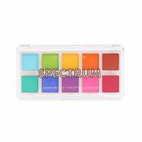
“The Spectrum palette is now one of my favorite eyeshadow palettes. It has a bargain price, but the quality is fantastic. I find that using an eyeshadow primer ensures that the color payoff is high and that the colors remain bold. Profusion had THE most amazingly pigmented colors, especially for being a drugstore line. It's a whole new level of amazing!”