“The colors were printed very dull, I don't know if its due to the fabric. I hoped the colours would be more vibrant. The feeling of the fabric is good.”
Thank you for your feedback!
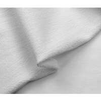
We appreciate you taking the time to share your experience. Each fabric absorbs ink differently, which can affect the vibrancy of the print. French Terry, being a more fleece-like fabric, naturally results in a softer, less vivid print compared to smoother fabrics.
We understand that everyone has different expectations when it comes to print results, and we'd love to help you find the best fabric for your designs. If you need any advice on which fabric would bring out the most vibrant colors, feel free to reach out—we’d be happy to recommend the best options for your needs!
Thank you again for your order, and we hope to assist you in the future! 😊